Within the last year, you may have noticed the interior of your home is a little glum. What’s the easiest (and most cost efficient) way to freshen up a space? Paint, of course! Unfortunately, it’s so easy to get caught up in the paint aisle. There are so many colors, finishes and paint manufacturers to choose from.
How to Choose a Paint Brand:
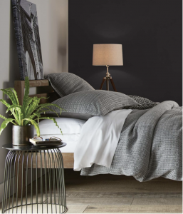 When choosing which paint brand to buy, here are a few things to consider:
– Paint quality varies vastly from one manufacturer to another. Choosing a high-quality paint will affect the outcome of your project greatly, so do your research through unbiased sources. Warranty is also something to consider.
– How much square footage do you need to cover? Most one-gallon cans will cover anywhere from 300-400 square feet. The manufacturer will have that information on the side of the can.
– What sheen would you like? In the past, sheen often dictated cleanability, with higher glosses being easier to clean. That is not necessarily the case now, as many manufacturers are releasing paints that are washable as well as scuff and stain resistant in a variety of finishes to include flat and matte.
Choosing Color!
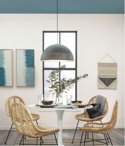 Now that you have settled on the type of paint and how much, you’ve arrived at what many people consider the fun part. It’s time to choose color! Here are some tips that many professional color consultants use.
– What stays and what goes? Review what items will remain as part of the interior. These will influence and usually narrow down your color choices.
– Personality & style. What are your interests and how would they influence color schemes? Many paint companies release paint trend forecasts every year. These are nice to reference, but it’s more relevant to create the space around your personal tastes.
– Create ambiance and flow. Color choice will be dictated by the atmosphere you want to create. Warm versus cool tones can change the mood. Consider how one color will affect another and the story it will tell as you travel through the space.
– What sparks you? Inspiration can come from just about anywhere! Review those resources (mood boards, magazines, social media, etc.) that inspire you to see what themes recur. You can usually find a common thread and start building your color schemes from there.
– The Fifth Dimension. Ceilings are often painted white. However, a look back in design history reveals ceilings were often a critical part of the overall design of a space. Maybe you have special molding of a light fixture you’d like to enhance? The ceiling could be something to consider painting a differing shade!
– Accentuate the positive. Consider accentuating a special feature in the room. Feature walls, special moldings, or a display space may call for a differing color and approach to the overall palette.
– SAMPLE IT! There’s no substitution for an actual paint sample. Color does not exist in a vacuum and is subject to its surroundings, including flooring and draperies or other soft finishes. Resist the urge to paint your sample on the wall; better to buy some white canvas boards at your local hobby shop and create a portable color sample that you can move about the room(s) to see how the light will play on the color.
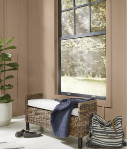 A special word on lighting, as this tends to influence the fidelity of the chosen color much more than people think. Take stock of the light sources that exist or that you plan to place in the space as the quality and quantity of light will affect colors. Take the color chips and look at them under the light that will be in the room.
Lighting will also play the sheen of the painted surface up or down. Do you have a textured wall you’d like to de-accentuate? Try a flat or matte sheen in a washable paint. LED bulbs will light a space very differently than incandescent. Ambient versus task lighting will also affect how the color plays on the walls.
Of course, natural lighting should also be considered. This is referred to as exposure and is referenced by the direction from which the natural light comes. Natural light changes, of course, from dawn to dusk. This play of light will affect how your color looks on the wall.
Pay Attention to Exposure!
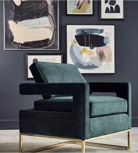 Certain colors do better in certain exposures. Here’s a breakdown for each.
– Eastern Exposure: The bright yellow light of an eastern exposure is ideal for high-activity rooms like kitchens, playrooms, and family rooms. Pale colors will glow here. Warm pinks, corals, yellows, or white will enhance the light, while cool blues and greens will temper it.
– Western Exposure: Light from a western exposure is often muted, thus allowing for greens and creams to take on different dimensions. Complementary colors, such as green and red, are not quite as garish. Reds appear richer and less flat because they absorb light. The color red is throught to promote conversation and a feeling of intimacy and suits dining rooms well.
– Northern Exposure: Cool, indirect light comes in from a northern exposure. Depending on where you live, the light can appear grey. To counterbalance this effect, choose a yellow cream or warm, pale pinks and corals to amplify the sunlight.
– Southern Exposure: Southern exposures are often most sought after as they get the warmest light throughout the day. A mid-tone color such as lavender will look fresh in the daytime and become richer at night. Rich blues and greens lose intensity but can appear to glow. Browns appear less somber in southern light. A warm, earthy hue works well in a southernly exposure.
There are many factors to consider with your painting projects. Hopefully these tips will give you some confidence in your next home project. Go on, just paint it!
Painting can be a difficult process, but BEHR is here to help! Visit their website here to browse their selection and make the right choice for your home.


